These are tests for the two main backgrounds for my project, i looked at making them fit with night and day to see how they would look, you can read more on the pages about that aswel :D
Sunday, 31 January 2010
..house development....
this is some house development, again read it if ya wanna know more. :D
This i kinda did for fun aswel :D i planned out what the house would look like, i thought it would help when working out th camers shots for the room and stuffs, and lets be honest I had fun doing it. :D
there is alot of writing on this one so i suggest you have a read :D i was looking at backgrounds and how to colour them and stuff, i want the same colour sheme to follow on throught the story and change brightness for when its night, day and when the hero is helping him.
..the comic....
this is my comic. again you can read more by having a look at the pages because i think iv said all there is to say on them and i would just be repeating myself. :D
...props...
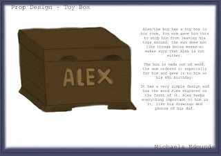
i did lots of design pages for these props aswel, im nto gunna put them up aswel though coz theres lots and the main thing is i reached a finally design, to find out more about each final design read the page :D
...bammmmm....
i had a go at using google sketch up, read it to find out more because i explained it all on the pages :D
..action monsters...
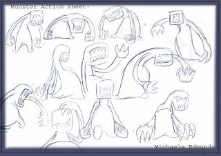
This is a pgae each of action sheets for the monsters, i found alot of them were basically the same because there all monsters so there all doing monster things :D
..hero action poses...
I found the hero harder to do the action poses i dont know why really, i think its because i didnt enjoy doing it as much as i enjoyed doing the boy drawings.my favourite one is on the second page on the left, its simple but i think thats why i liked it.
..action pose mama...
mum action poses woohoo, these were just random things she may do as part of her characters personality. :D
..boys actions...
These are some action sheets for Alex, i looked at trying to have in oses when he would be scared, tired and preparing to fight monsters, some are more successful than others.
...character turnarounds....
well this was possibly one of the most painful parts of pre production, I can't say i enjoy doing turnarounds that much and doing 7 of them took ...well...a long time, the monster ones were alot easier than the others. I spent the most time on the boy because he was the most important. I was happy with that one. I wasn't realy happy with the hero and the mum. Overall there ok, im not very good at drawing characters from the side I need alot of practise.
...development of the characters as a whole.....
I did the outline characters page and decided to develop the character as a group, i looked at how their silouettes worked, this was really successful, you can tell the difference between the good and evil characters, the good ones have all rounded edges and the monster have sharp edges on their hands and are more pointy.
I took the textured pieces I did for the individual characters and put them together to see how they looked, this workd realy well, i think the colours work nicely aswel . It would be nice to maybe incorrperate the fabric effect on my final piece with the monsters.
These are the basic colours i chose for the characters. i may change the colour of the hero slightly becasue it looks a but sharp, you can see this easier when all the charactersa are put together.
This is the basic construction of the characters that I will use when im animating them.
...character lineup....
This is my outline line up of all the characters, I was really happy with them when I put them all together :D I think it works really well.
...fabric woopwoop...
These are the fabric things i did for all the other characters aswel, i did them all indivually first the put them together to see how they looked, i think these were the most successful :D the purple fabric i used looks really good, the dark and light folds in the fabric work realy well :D i likes them i do.
...monster colour work...
developing the monster...oh yea hehe....i looked at different colours i could use for my monster....i knew i didnt want them to be the same colour. I figured i didnt realy need to colour test every monster so did them for the littlest one then from those colours decided i liked purple and looked into slightly different shades then chose which ones were my favrouite. I found the colours tests quite helpful, its interesting to see the difference it can make just by using a slightly different shade of the same colour.
...oh yea expressions are here.....
These......Obviously are some expressions for my monsters, was bit hard with these because theres only the mouth and then the body movement to show expression :D
...grrr aghh....
the first one is the final designs i decided on for my final ones, alex helped me to design these then I developed them a bit. :d when i was happy with designs i moved on to looking at expression and character sort of moevments sheets a bit, these two sheets were early sketches and rough drawings just messing with the characters a bit.
Subscribe to:
Comments (Atom)


